Navigation in website design does not undergo many changes. It includes almost the same elements, always meets the audience from the outset and modestly takes its place in the top header. Since the popularization of the hamburger button, nothing earth-shattering has happened. However, this does not mean that its life is boring and uneventful.
As an integral element of the UI and a crucial part of good user experience, navigation never abstracts itself from design or distances from trending solutions. It always manages to blend in, but not get lost in the spectacle that awaits in the modern hero area.
Designers conduct various experiments to adapt it to new realms to come up with exciting solutions. And one such attempt to create navigation that meets the mainstream results in ultra-narrow, sticky vertical navbars.
We have already seen narrow sidebars. However, this time it differs a little bit.
The renewed version is more compact, minimal and elegant. It bets on popular features like vertical lettering. And most importantly, it sticks to the screen and follows the user through the website, complying with all the basic requirements of good navigation. Let’s consider some representative examples.
Austin McKinney
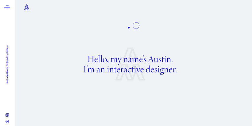
Our first stop is the personal portfolio of Austin McKinney. Here, the vertical navbar includes only the essentials: a hamburger button, links to profiles in social media platforms, the name and occupation of the artist.
Thanks to its white, clean, and ultra-narrow design, it perfectly blends into an overall light environment with a powerful geometric vibe. It creates a necessary anchor for online visitors, providing them with helpful information.
Editorial New
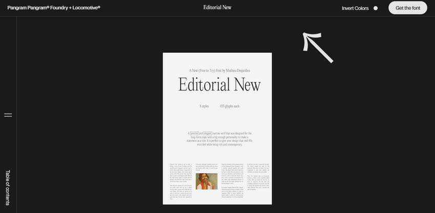
The team behind Editorial New shows us that the solution is quite universal and works regardless of coloring, stylistic options or interactive details. What’s more, it is an ideal partner for websites that position themselves as online magazines.
Here the navbar includes just one element – the hamburger button. It opens a slide-out menu with a table of contents. Since it sticks to the left side of the screen, wherever users are on the page, they always have quick access to links in order to jump from one section to another.
Note, unlike the previous example, here the vertical navbar is a part of the perimeter navigation that makes the design look complete.
The Crowdfunding Formula
The vertical navbar of Crowdfunding Formula is located on the right side. Although we are not accustomed to seeing it there, nevertheless it works perfectly. What’s more, thanks to the contrasting orange color that marks the logotype, selected menu link, and search button, the sidebar naturally catches an eye.
Note, it does not have any borders: it just seamlessly flows into the design. However, thanks to the boxy vibe that runs throughout the page and generous amount of whitespace, it gets its own place under the sun.

NSDI
The team behind NSDI uses a vertical navbar for displaying not just the hamburger button, but also pagination for a full-screen slider. Another distinctive feature is that all elements move with the user. Here, you can see an ultra-narrow vertical navbar and corner navigation that co-work together in order to create a comfortable user experience.
Much like in the case of The Crowdfunding Formula, here navigation does not have a distinctive background. However, the team has used contrasting colors to naturally set the elements off from the composition.

Cervelo Cycles
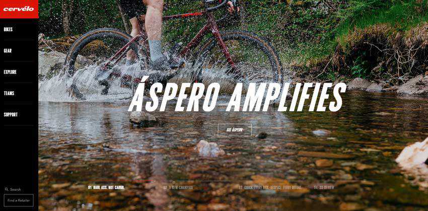
Cervelo Cycles has a more-or-less traditional sidebar, though this fact does not stop it from looking trendy and refreshing. It covers all the menu links, logotype, search field and CTA. It is relatively wide and stands out from the content flow due to its solid black background.
Its key feature lies in a small transformation. The sidebar morphs into an ultra-narrow vertical line with everything hidden inside once the user starts to scroll down. The minimized version has only the hamburger button in the center. However, it is precisely what is needed for online visitors to avoid getting lost in the content-heavy environment.
Villa Covri
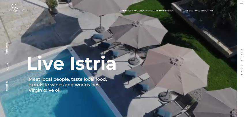
The official website of Villa Corvi has not one but two ultra-narrow vertical navbars. The first one includes only social media links displayed in vertical rhythm, whereas the second one comprises the button to the inner menu and nameplate. Along with the upper header, these two strengthen the subtle boxy vibe of the website.
Note, only the right panel sticks to the screen and moves along with users. It transforms into a horizontal line on tablets and cellphones to create consistency across various devices.
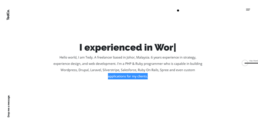
TedCo
There are two important takeaways from the official website of TedCo.
First, much like in the case of Editorial New, here the vertical navbar is a part of the corner navigation. It looks neat, elegant and informative. It finishes off the sophisticated design of UI.
Secondly, the path of exploring the website is unconventional. Instead of moving down, users scroll to the right along the X-axis. Here the vertical navbar stays where it is, giving users the necessary focal points to feel comfortable.
Rogue Studio
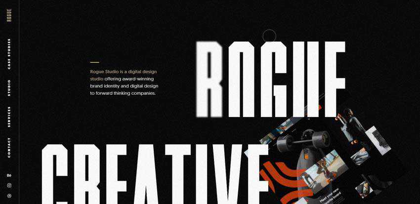
The navbar in Rogue Studio is an excellent example of the solution where all the navigation links are exposed to the audience. On top of that, the creative team managed to gracefully include logotype and social media icons.
Although the component looks more cluttered in comparison to the previous ones, it has one significant advantage over them. It gives users what they need right here, right now without unnecessary moves.
Reasons for Going Vertical
Sometimes, we can see a designer’s exciting take on the main navigation that breathes new life into the component. Sticky vertical navbars are one of them. Even though they are not something brand-new, they feel refreshing.
There are several good reasons to use them. First of all, they are compact, serving as an ideal tool for those who want to use the entire hero area for entertaining. Secondly, their size is appropriate for the various small devices that dominate these days. Third, thanks to sticky positioning they are perfect assistants that make the user experience more comfortable.
And finally, continually displaying the logo or name of the artist is an easy way to enhance brand identity.

